True colours
Colour has meaning. There is evidence to suggest that the cultural use of colours as symbols happened as early as 90,000BC. How we interpret the use of colour varies depending on individual associations and learned responses. Interpretation also differs across cultures, as a result of environmental influence, as well as age and gender.
While it’s not possible to account for all interpretations, your packaging is part of your branding. As such, your design should align with your brand palette, and reflect your product and its purpose.
Big brands use colour cleverly. Coca-Cola’s red cans are iconic. They promise a consistent and authentic taste synonymous with the drink, in every can. Apple’s packaging is white, which denotes simplicity; this aligns with its intuitive-to-use products. Its packaging showcases four things: the logo, the product name, a picture of the product, and product information. Paul Smith luxury brand clothes come in elegant packaging. The plain, logoed bags scream ‘money’. They use colours from the designer’s signature stripe pattern. Blue and purple hues coat the ins and outs of the box.
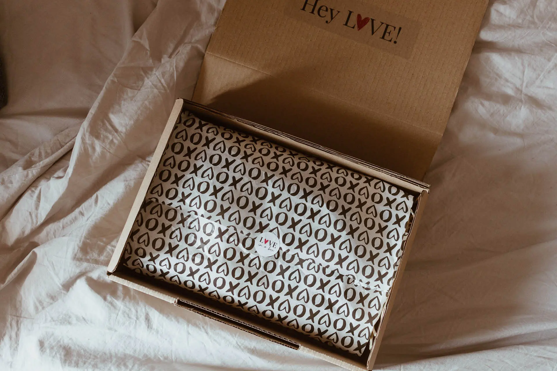
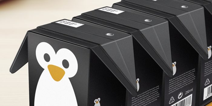
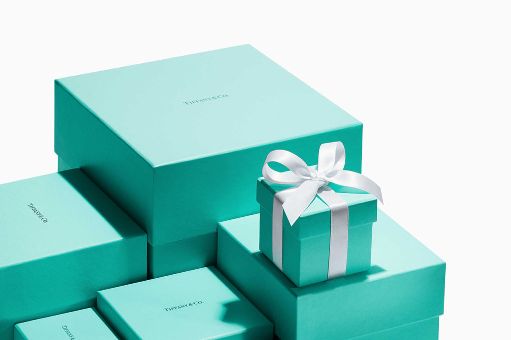
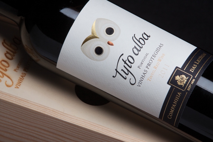
Consider monotone for modern, elegant simplicity; complementary shades or analogous colours (those next to each other on the colour wheel) for health and wellbeing products; bright colours for high-energy items; earth tones for natural products or gender-neutral marketing; eye-catching patterns or contrast prints for stand-out shelf presence. If understated is more in keeping, a simple white box with a contrasting colour sleeve or colour pops is a cost-effective way to introduce a splash of vibrancy with a modern twist.


