When designing a brochure or leaflet, there are many things that you will want to consider
- What content can I use?
- What size should I go for?
- How many pages does it need to be?
- What about the design and the imagery?
This might not seem an important thing to consider at the initial stage, but thinking about how the end user is going to handle the piece of print, how easy it is for them to read the content and how the whole piece will flow can all come down to how it is folded.
There are many different options, which mainly depend on what the printed piece is going to be and the number of pages it consists of – both of which naturally impact how it can be folded.
With this in mind, we’ve put together a quick guide on the most common folds we are asked to produce – and the results you can expect from them.
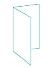
This is simply folding a single sheet of paper in half to create 4 pages, either landscape or portrait depending on how you want the piece to be presented when finished. There is equal space on each page, with plenty of room on the 1st page to grab attention
Best for guiding the user from front page to back page, so getting important information across that needs to be presented in a formal format.

Tri-fold involves folding a single sheet of paper into thirds – think a of a letter being folded to go into an envelope. Put simply, it divides one sheet of paper into 3 equal panels
This is a really versatile fold. While folding letters to put them into envelopes is top of the list, it’s also really effective as showcasing products or a project where you want to make a real impact. When cleverly designed to open with a full sheet to view, you can really pack a punch through graphics and imagery.
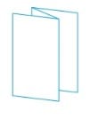
Think of this fold like a concertina. It doesn’t have to be restricted to just 6 pages, as this type of fold can accommodate more if required. It folds a single piece of paper into equal sections, depending on the number of folds.
When would I use this?
This is great for taking the reader through a narrative, as you can run content from one page to the next. Step by step instructions is a good example for this.
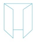
A gate fold takes a single sheet of paper and folds it into 3 unequal parts, with 2 side pages smaller than the back to create a gate like effect when opening to create a 6pp document.
This is great to showcase a product or a project, as when the ‘gate’ opens you are presented with one large panel. Think of it like opening the doors to showcase something spectacular!
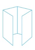
Similar to the gate fold, but we are now dealing with 8 pages rather than 6. The single sheet of paper is folded into 4 equal panels, but still with the gate effect when opening.
If you have more information to portray you might want to consider this option, as when opening you have the full sheet to display your products or project, with 4 smaller panels on the outside to give bite size pieces to the reader.

Slightly ,more complex, the roll-fold takes the single sheet of paper and creates a fold that rolls inwards, like a spiral. It can be used with a number of different page counts, and leaves you with numerous sides available for content.
If you have a lot of information with a clear flow, smaller graphics work better with this fold
This is by no means an exhaustive list, but we’ve tried to cover a few of the most common styles. If you want help deciding which is best for your project, or want to know more about the different folds we can do then please get in touch
© 2023 Galloways Printers Limited. All Rights Reserved | Registered Office: Malcolm House,
First Avenue, Poynton, Cheshire, SK12 1YJ | Registered No: 00174272
Privacy Notice |
Cookie Notice
(Manage Consent) |
Sitemap |
Terms and Conditions |
Core Labour Requirements Policy Statement |
Credit application form